Customer Area – Illumia
SaaS customer portal for utilities
Building the SaaS digital touchpoint between an energy provider and its customers from scratch by designing a scalable, empowering self-service platform for both residential and business users.
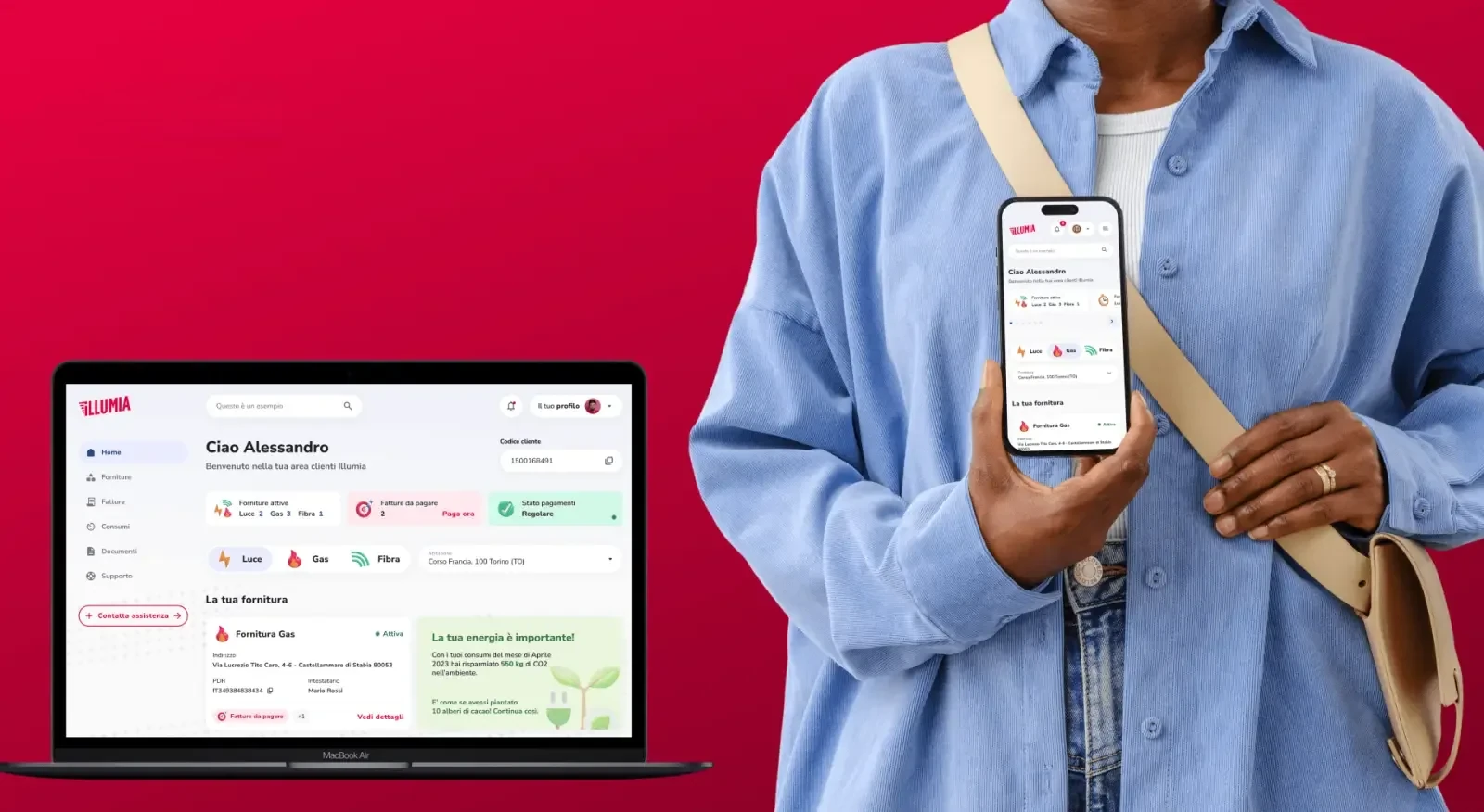
CORE PROBLEM
No dedicated SaaS customer platform
Illumia had no digital channel of its own for managing energy contracts. Checking a bill or changing a supply address meant calling support: a cost for the company, a wait for the customer. The platform had to solve for:
- A unified SaaS dashboard capable of handling users with multiple supplies (electricity, gas, fibre) across different locations or properties without creating separate interfaces per contract type.
- Intuitive, memorable navigation that required no onboarding users should land and immediately understand where everything is, from day one.
- Transparent, readable consumption data presented in a way that builds trust and reduces billing-related support queries one of the most common pain points in the Italian energy market.
- A structure flexible enough to serve both a single-home residential customer and a property manager with multiple concurrent contracts typical SaaS multi-tenancy challenge within the same product.
DISCOVERY
Building from scratch meant no usage data, so I asked the people who would use it. Qualitative interviews with Illumia customers across contract profiles, plus a benchmark of Italian and European providers.
Semi-structured interviews
Semi structured interviews with three profiles: single contract residential, multi supply residential, and property managers with contracts across several sites. We asked how they handle contracts, bills and support today.
Map the real jobs-to-be-done
Instead of asking which features people wanted, we mapped the tasks they already did by phone, email or workaround, and the friction in each. Requirements came from behaviour, not from assumptions.
From insights to design principles
The interviews were synthesised into four design principles that governed every later decision, from architecture to component behaviour:
- Self-service first: every task a user currently calls support for must be completable independently within the platform.
- Multi-contract by default: the architecture must handle one contract and ten contracts with equal clarity, no special modes, no separate flows.
- Radical billing transparency: consumption data and bill breakdowns must be human-readable, not just technically accurate.
- Responsive without compromise: the core task set, payment status, bill access, supply overview must be fully accessible and functional on mobile.
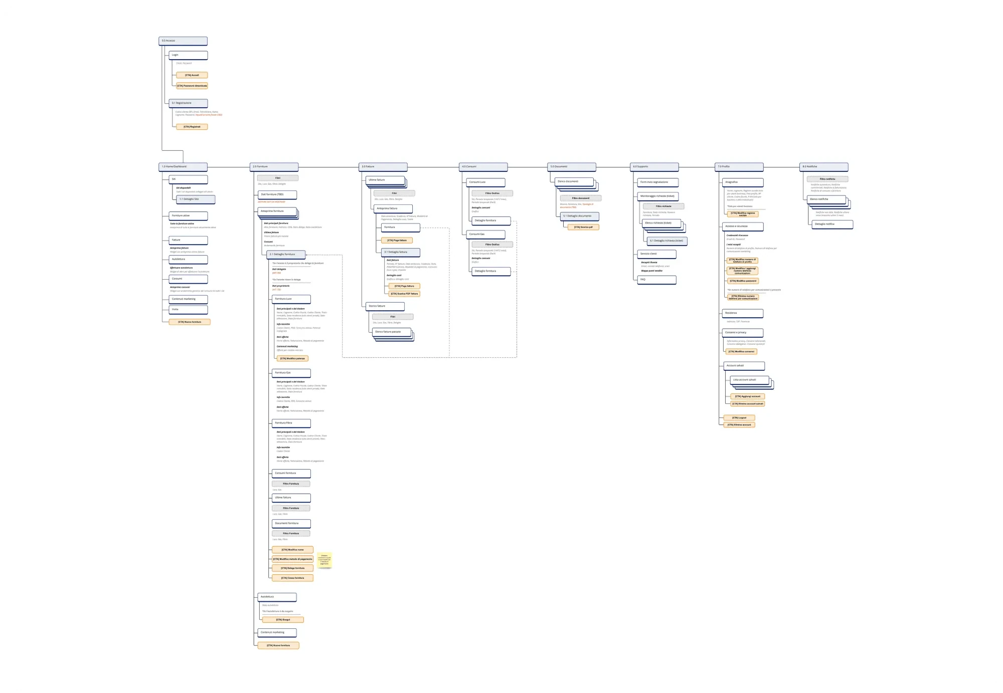
UX DECISIONS
Four design principles that shaped every decision:
Easy navigation
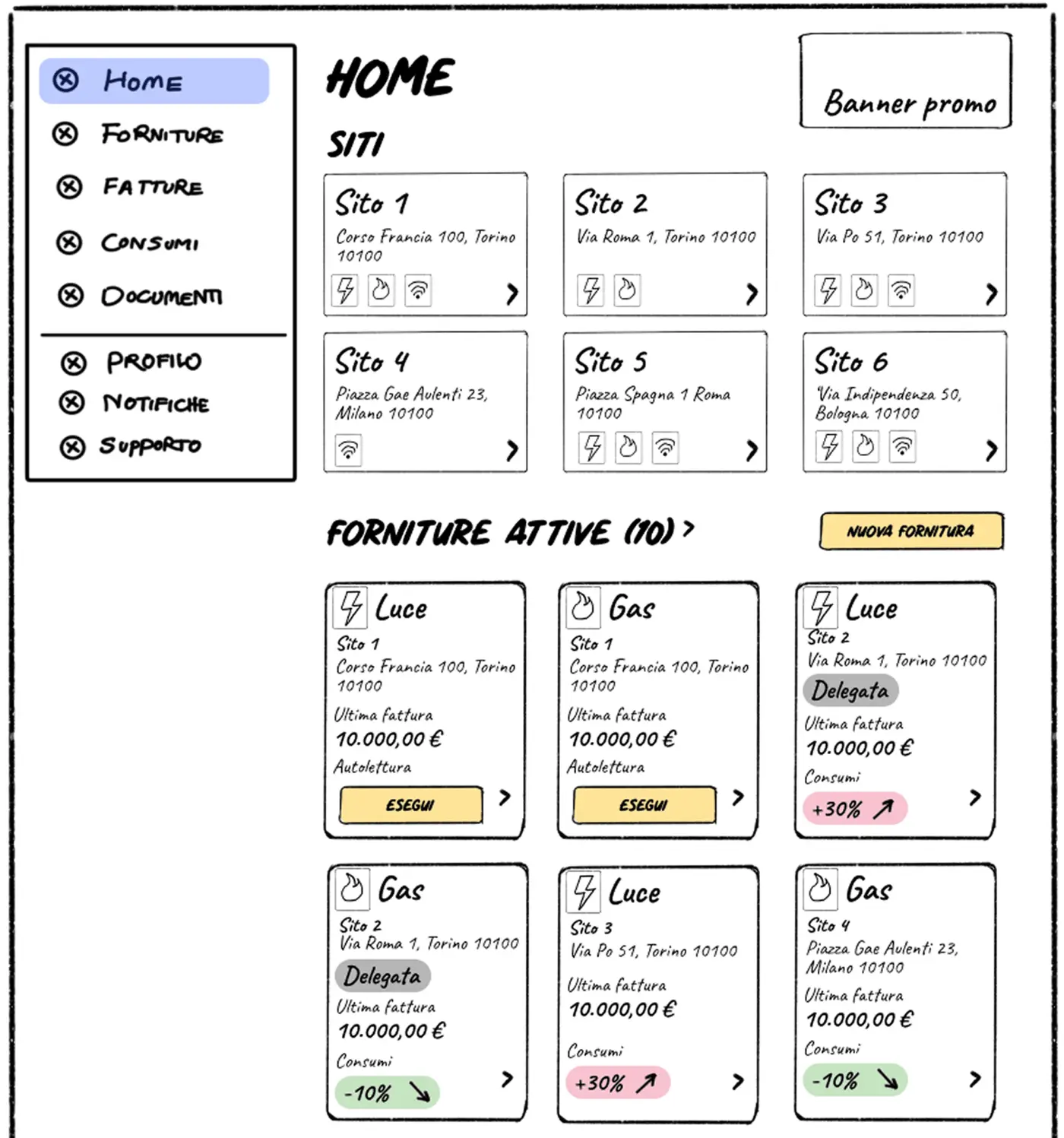
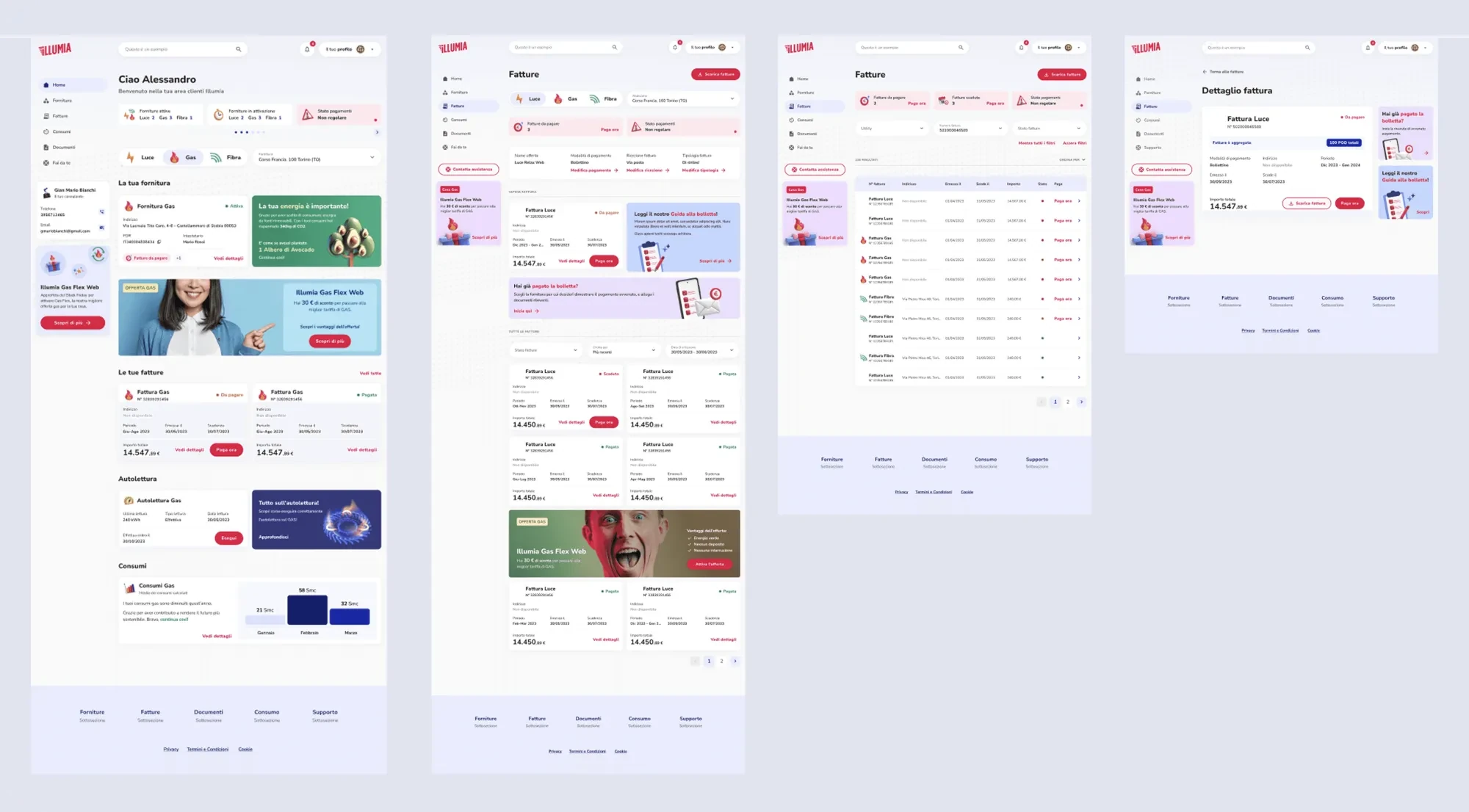
Vertical lateral navigation paired with a bento box home. Checking payments, viewing consumption or managing a supply stays one click away, every section two interactions from anywhere.
Flexibility with different user types
The same structure has to work for a single home contract and for a property manager with supplies on several sites.
Transparency in data provision
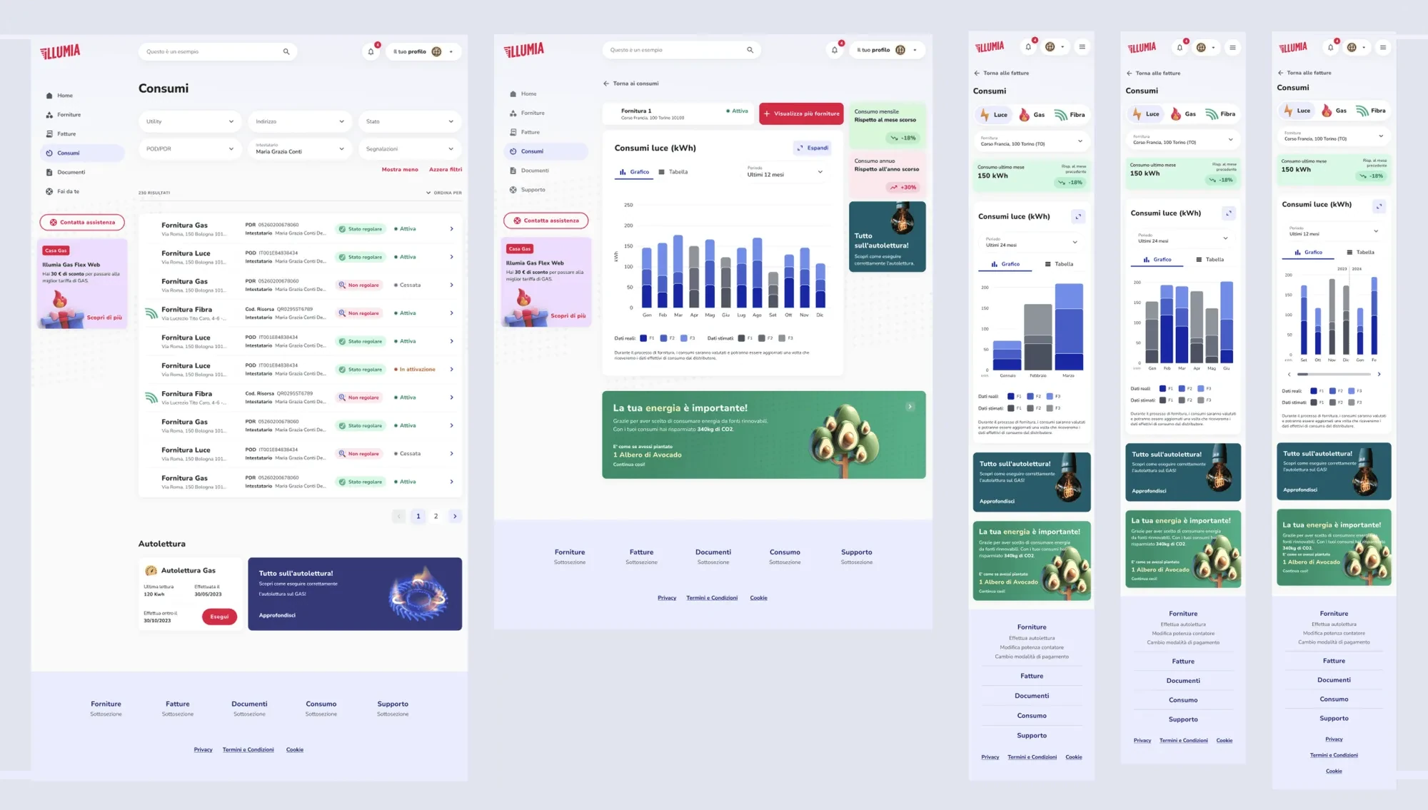
A readable overview of consumption, split by supply type and period, answers the most common complaint in the Italian energy market: opaque bills.
Simplicity
Supplies and services readable and reachable from the dashboard, so self service becomes the default rather than the exception.
IMPLEMENTATION
Concept design
With the navigation settled I mapped six sections: Home, Supplies, Bills, Energy consumption, Documents and Support. The structure had to hold for one supply and for a manager crossing all six daily.
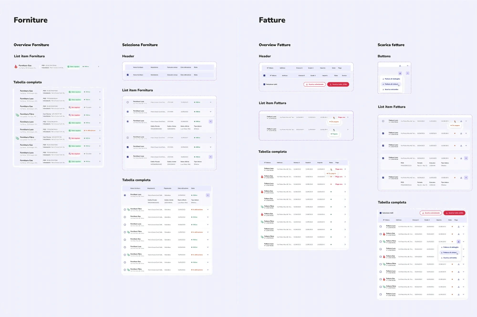
Visual design and design system
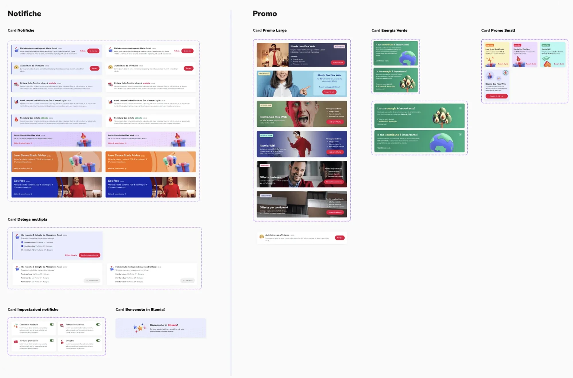
Illumia's brand set the design system: bold red for primary actions on a clean white UI. Dense data drove the rest, high contrast, semantic colour for status, components that scale without visual drift. On a platform handling billing data, consistency is what makes it trustworthy.
The interface is responsive down to the phone. For Illumia that matters: people check payments and read bill notifications on mobile, which carries the same weight as the desktop.
IMPACT
- concurrent supply contracts, no UX degradation
- 10+
- reduction in support contacts for information available in the customer area
- 35%
Applying this UX strategy resulted in:
- Faster task completion for key flows (bill payment, consumption check)
- Reduced cognitive load through consistent SaaS navigation patterns across desktop and mobile
RETROSPECTIVE
Building from scratch is a privilege and a responsibility. With no legacy to work around, every structural decision was ours, and so was every mistake.
The SaaS dashboard-as-command-centre pattern eliminated deep navigation from day one.