Agents Area – Illumia
SaaS portal for energy sales agents
Rebuilding the operational backbone hundreds of sales agents rely on daily into a clear, permission-aware SaaS platform built around two distinct working modes.

CORE PROBLEM
A system everyone used, nobody designed
The agent portal carried the whole sales and post sale organisation, and it had grown without design direction: navigation that misrouted people, forms that wiped data without warning, no confirmation before destructive actions, tangled permissions. Plus 15+ new capabilities, on a live system hundreds of agents used daily.
DISCOVERY
AS-IS analysis
I audited every existing flow, tagging each observation as pain point, note or dev constraint. The isolated bugs turned out to be three systemic failures: no confirmation before destructive actions, no form state feedback, and step navigation that broke. AI clustered hundreds of observations into a diagnosis.
Client requirements
The client's internal interviews carried one structural insight: the platform serves two channel types. With consultants, the full surface; teleselling, a reduced one. Not a permissions problem, a different architecture for each.
AI ran a gap analysis between the existing features and the new requirements, sorting what needed extending, what needed a full redesign, and what was still blocked on the back end.
UX DECISIONS
From structure to screen
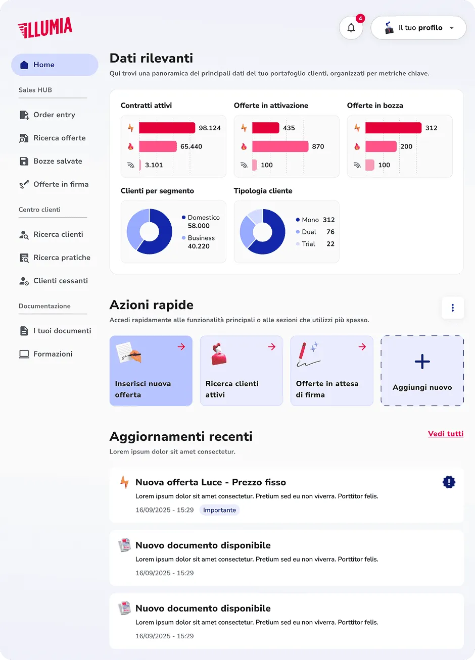
The architecture was rebuilt on one principle: the interface should say what kind of tool this is. Lateral navigation splits into a Sales Hub and a Client center, the two modes agents work in. Channels without consultants see no Sales Hub at all.
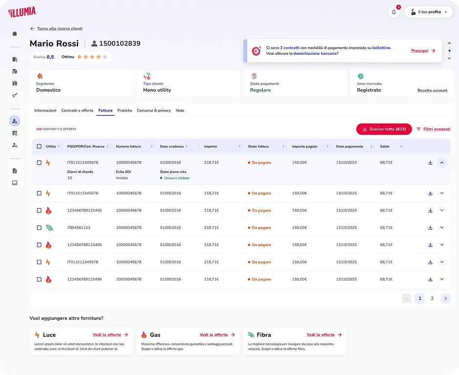
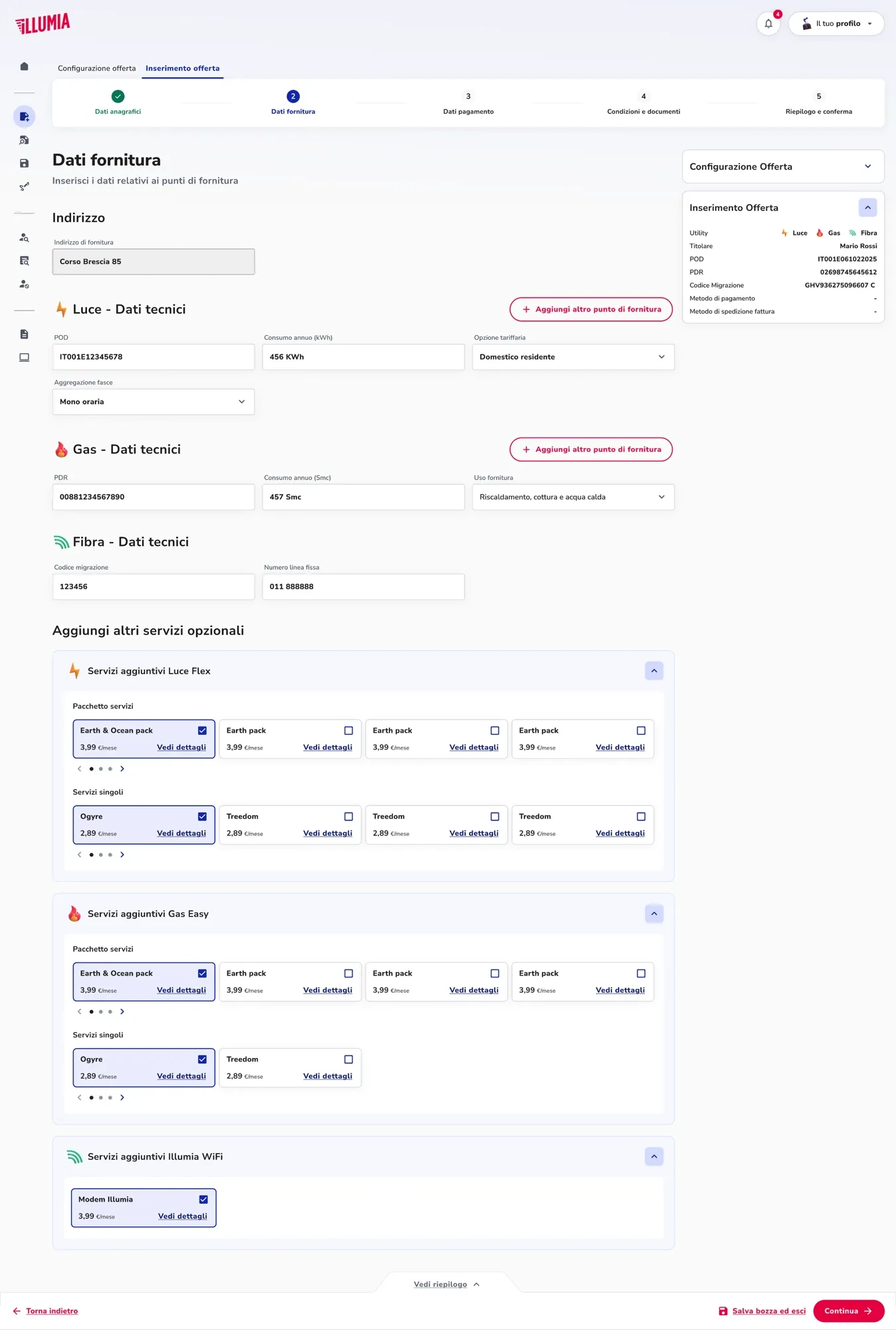
The client detail page became a tabbed hub with a persistent header: scoring, segment, contracts, payments. The contract wizard became one 6 step flow for gas, electricity and fibre, with save and exit at every step.
Before any wireframe, I used AI to simulate 8 agent profiles through the proposed architecture. Two structural gaps surfaced and were closed before a single screen existed.
IMPLEMENTATION
Concept design
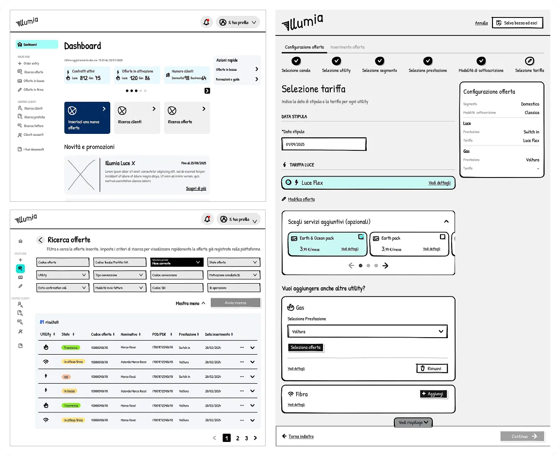
Wireframes covered every primary flow, annotated with business rules and edge cases. The offer wizard alone crossed utility type, segment, subscription mode and channel permissions, so AI generated the whole edge case matrix. A microcopy pass over 60+ screens caught tone drift and missing empty states.
Visual design
The UI continues from the Illumia Customer Area, the B2C portal I designed before (it's among my projects), so both surfaces speak one visual language. The design system gained B2B components: dense sortable tables, wizards with summary panels, a role aware shell.
Responsive coverage runs from 375px to the widest desktop: which columns hide, how the navigation collapses, how dispositive actions stay usable with a client sitting alongside.
RETROSPECTIVE
Most AS-IS problems weren't interface failures, they were business rules nobody had designed to be communicated. The AI moments weren't shortcuts, they were how one person carried eight months of analysis that would take a team.