hOn – Haier Europe
IoT app for smart home appliances
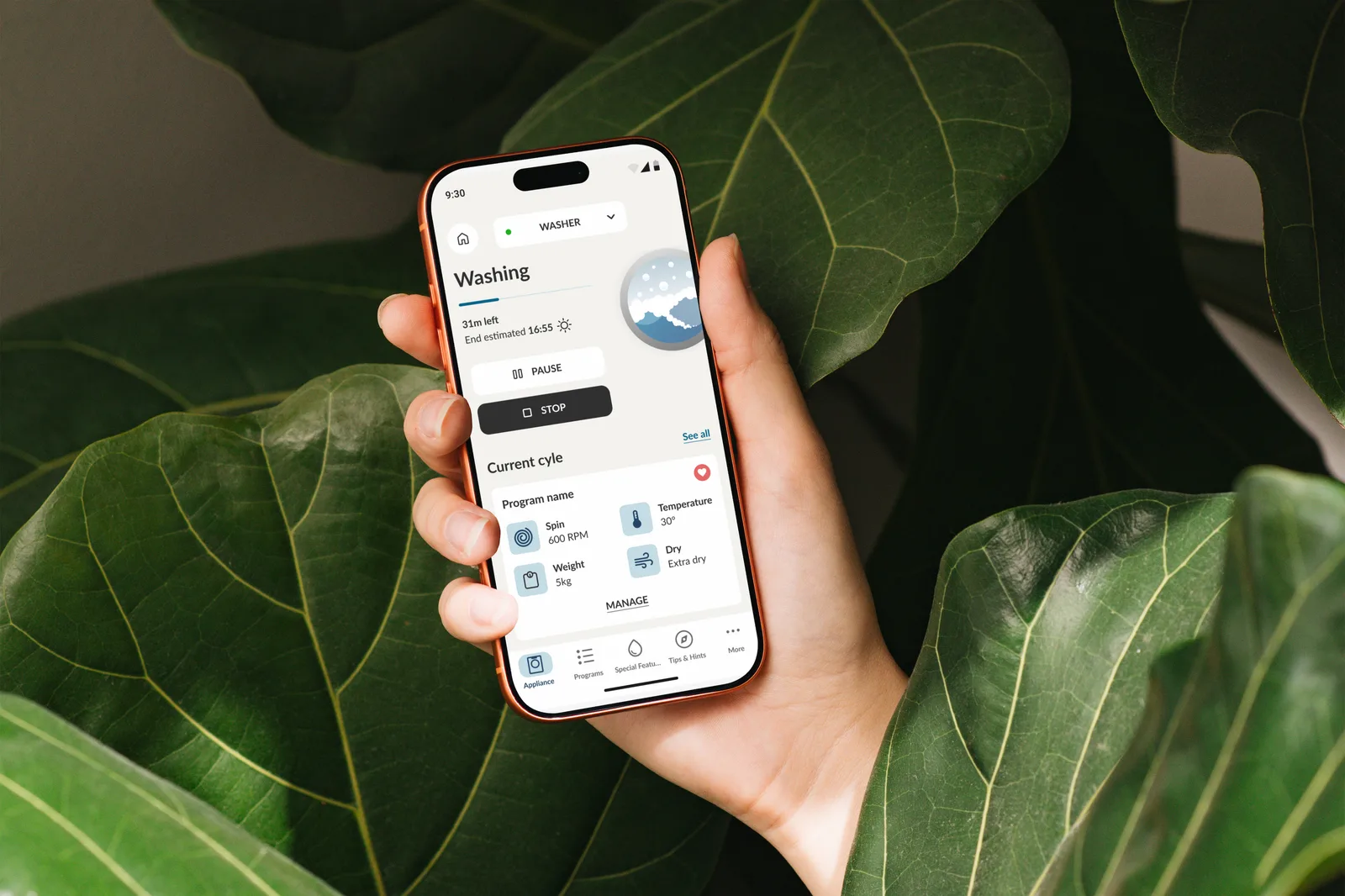
Continuous product design on a live IoT app, from appliance enrollment to a fully personalised home page.
PROJECT METHOD
Time & material, agile, on a live product
User stories arrived from Haier Europe sprint after sprint, on an app already in production. I worked with the PO and PM through grooming, concept, UI, handoff in Miro and Jira, and QA on the builds.
Over a year I designed dozens of features: appliance enrollment, program detail, widgets, and more.
Here I go deep on one of them, the one with the widest impact on the app.
CORE PROBLEM
An app built for owners, in a market full of non-owners
hOn controls Haier Europe's connected appliances, but also offers free widgets that work without owning anything. The home page ignored that.
- Empty home page for users with no appliance connected.
- Widgets looked like appliances. No visual difference.
- Same home for everyone. No personalisation, no reordering.
DISCOVERY
Three user types, defined by the client:
- hOn Consumers: own appliances. Want control and daily widgets, not ads.
- New Consumers: own nothing, evaluating a purchase. Want widgets and discovery.
- Tactical Consumers: own nothing, won't buy. Want widgets only.
Analytics confirmed it: a real share of active users had zero appliances enrolled.
UX DECISIONS
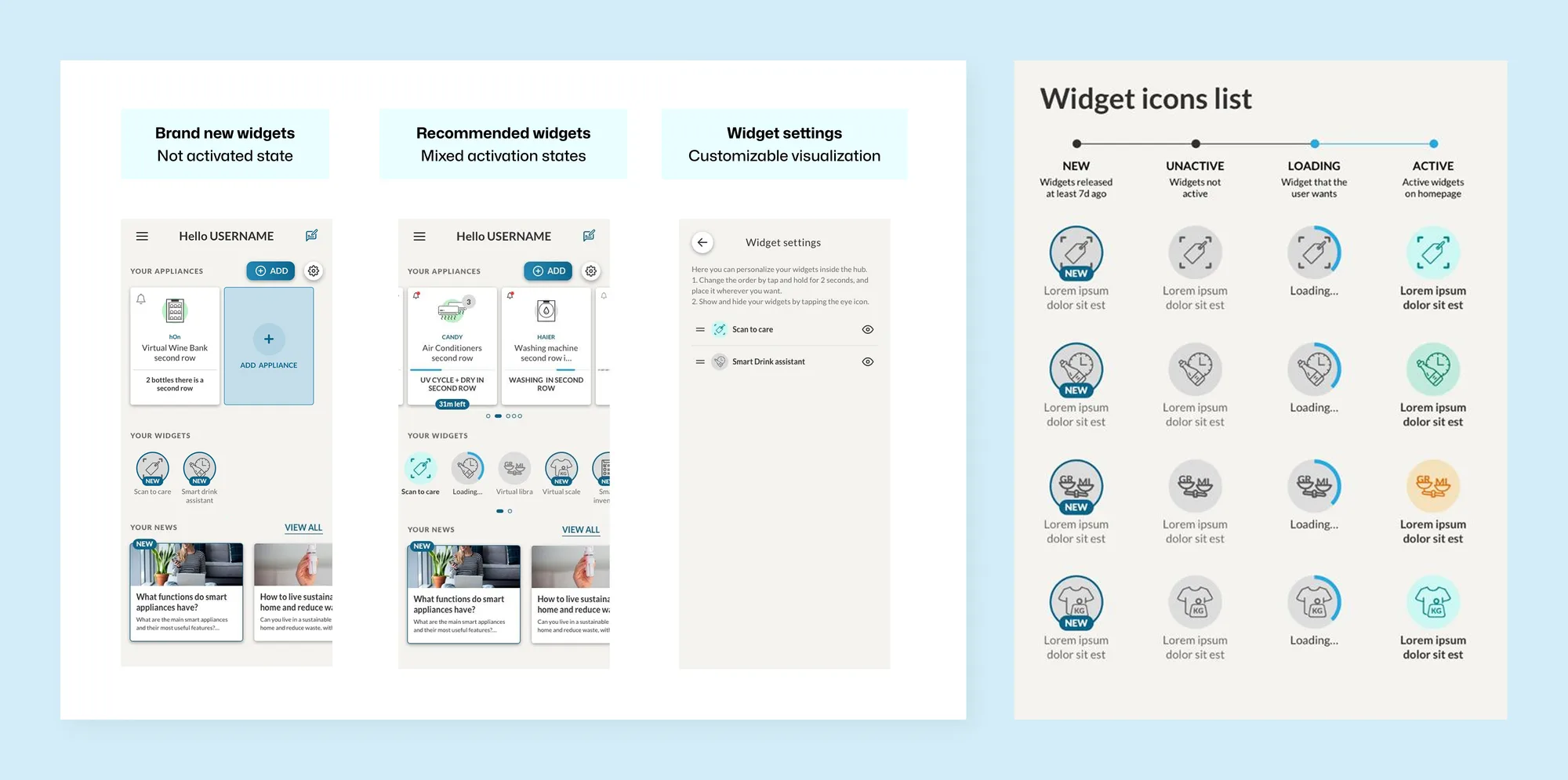
I split the home page in two: Discover for what’s new in the hOn world, My Hub for what the user actually uses, keeping appliances and widgets visually distinct so owners are never pushed and non-owners never land on an empty screen. The app suggests widgets rather than products to buy, users can arrange their hub as they like, and a shared system of four states (New, Inactive, Loading, Active) makes every widget readable at a glance.
IMPLEMENTATION
Concept
Wireframes of both entry states (with and without appliances), adding, arranging, removing and restoring a widget. Edge cases solved with the PO before development.
UI
Layout directions explored, then converged on the one reusing existing design system components. Widget icons built as one component system in four states, extendable to new widgets.
Handoff & QA
Documentation and assets split sprint by sprint, then continuous testing with QA team and developers.
IMPACT
- widget activation among users with no appliance enrolled
- +34%
- average active widgets per user, from 0.8
- 2.1
- first-week retention on new installs
- +22%