Hubsense – Inventronics
IoT lighting platform redesign
Redesigning the commissioning and management experience for a Bluetooth Mesh lighting ecosystem, from an AS-IS audit to a scalable, white-labeled design system.
CORE PROBLEM
A fragmented experience across three users and two platforms
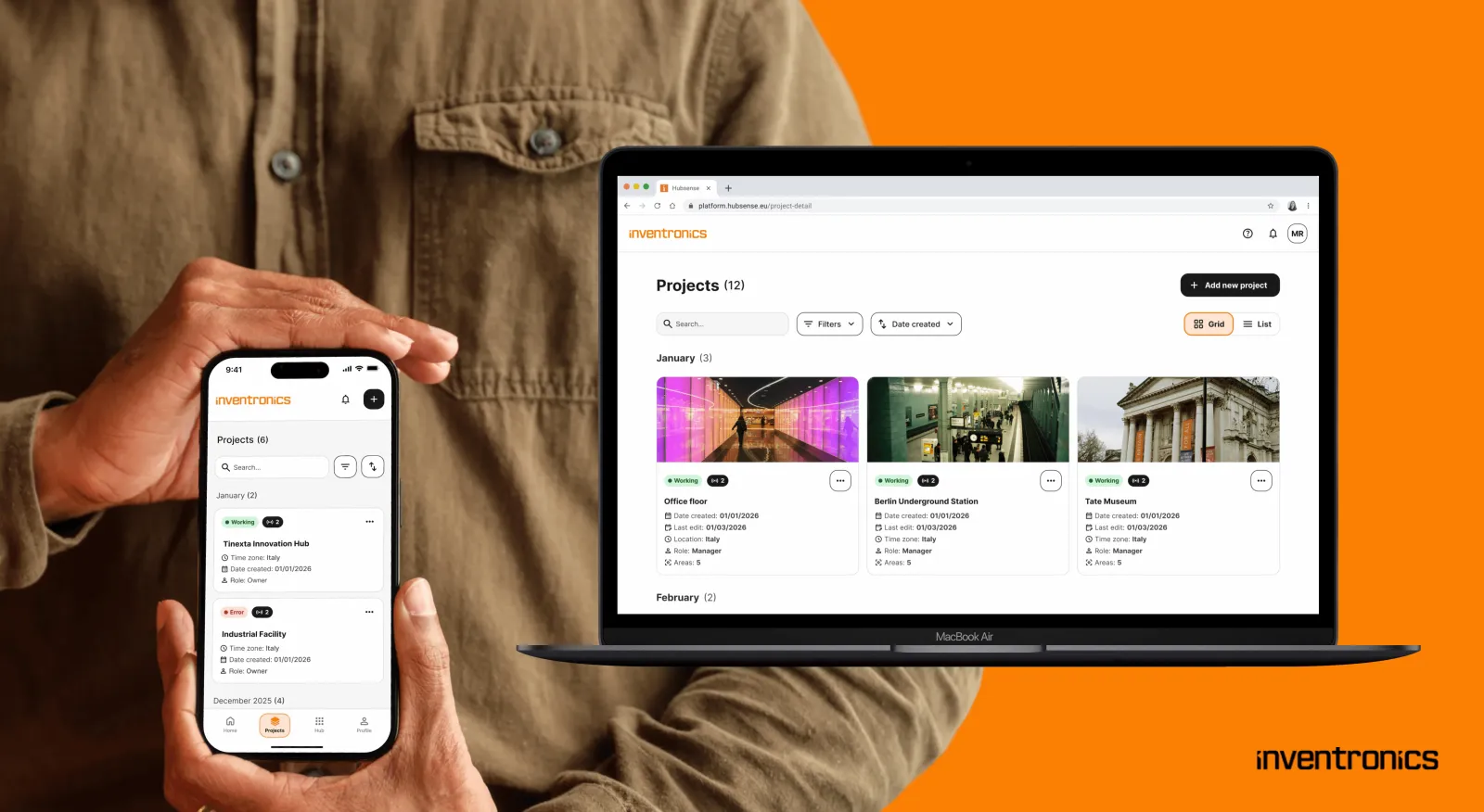
Hubsense is Inventronics' Bluetooth Mesh lighting ecosystem: a web configurator, a mobile app, and a range of field devices. It grew around firmware, not around real workflows. Main issues:
- Three user types (Manager, Installer, End User), no clear split of rights.
- Web and mobile covered different features, forcing constant switching.
- No usable overview for large projects (200+ devices). No table view, no bulk actions.
- No diagnostics for a mesh-based system. Faulty nodes stayed invisible.
- No structure for white-labeling. Brand and core UI were tangled together.
DISCOVERY
I audited the AS-IS web and mobile apps, benchmarked similar mesh tools, and interviewed real operators, including a technical manager with 20+ years in Inventronics. Key gaps: no drill-down floorplan, no way to duplicate a zone setup, no node control from web, no feedback when a node failed.
These findings shaped the to-be customer journey behind the concept phase.
UX DECISIONS
Split by capability, with overlap.
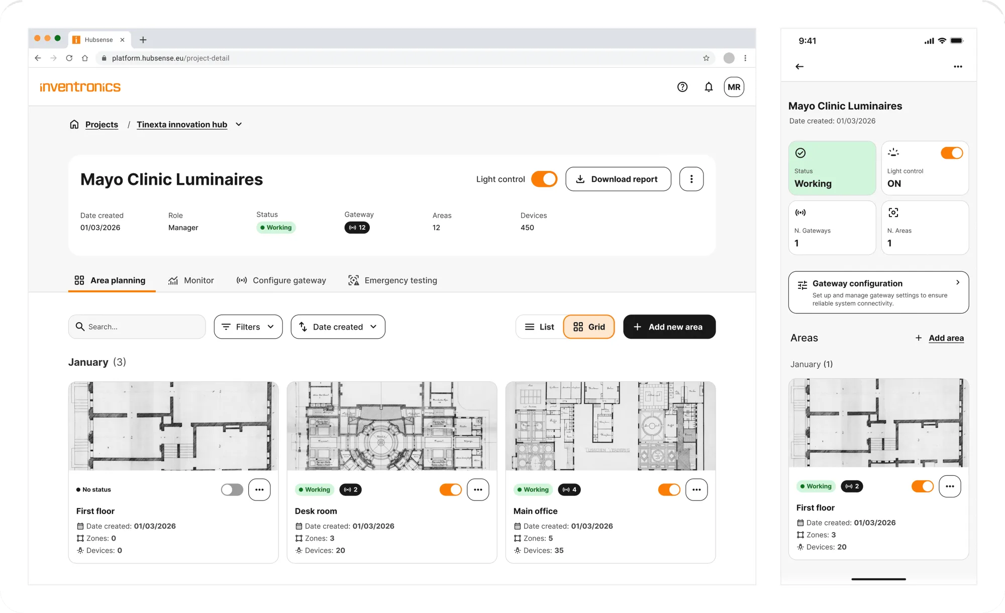
Mobile covers project, area and zone planning and device commissioning and live control on-site. Web mirrors the same planning capabilities except for which stays mobile-only since it requires physical proximity to the device. Whatever is created on either platform syncs and reflects on the other.
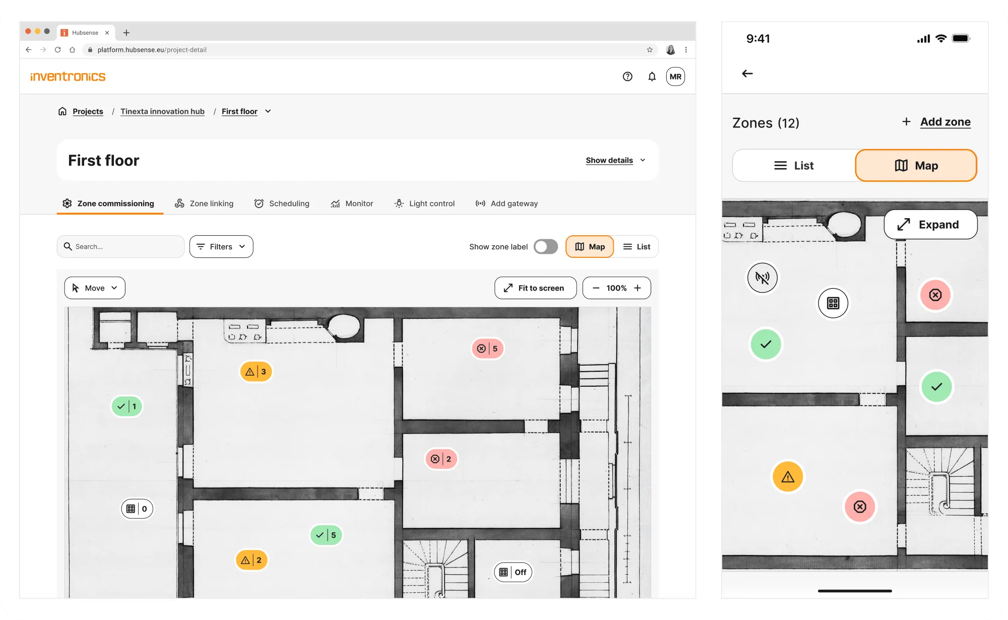
Hierarchy at scale: Project → Area → Zone → Device, with status hotspots and a table view for large projects.
Diagnostics as a core flow: Faulty devices and weak signal became visible, actionable states, plus a Mesh Quality test on mobile.
Role-based UI: Managers, Installers, and End Users each get a scoped experience.
IMPLEMENTATION
This project was run in agile, with PM, developers, and testers. I was the sole designer.
Concept design
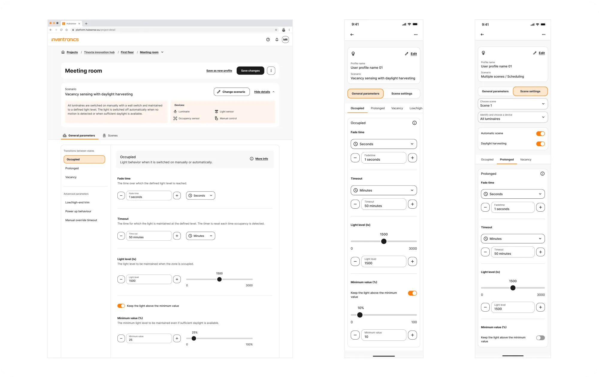
I wireframed both platforms in parallel and validated core flows with the client. Three areas drove the biggest UX gains: zone planning, restructured around a clear building-to-node hierarchy; device commissioning, reduced to one guided flow instead of scattered steps; and area monitoring, moved directly onto the floorplan for live, spatial status reading. Zone behaviors and scenarios were also simplified with progressive disclosure, common settings up front, advanced ones a tap away.
Design system and UI
I built the design system with Claude, generating tokens and components fast.
White-labeling became an architecture rule, not a final skin: a tenant's brand color is a single accent token, used only for identity/selection (splash, active tab, focus ring, selected states). Primary actions stay neutral for every tenant. This keeps one accessibility standard, protects visual hierarchy, and keeps emergency states from ever competing with a brand color.
IMPACT
- faster commissioning per project, from closing the web/mobile gap
- 40%
- fewer support tickets on faulty nodes, after adding mesh diagnostics
- 28%
- faster to locate a zone or device in large projects, with the new table view
- 50%+
RETROSPECTIVE
- Redesigning a live product means weighing every change against real installer habits, not an ideal flow.
- As the only designer in a large agile team, sprint reviews kept decisions grounded and caught scope drift early.
- Treating white-labeling as a token-level rule made safety-critical states non-negotiable by design.