SimplyMobile – Auriga
Mobile & web banking app redesign
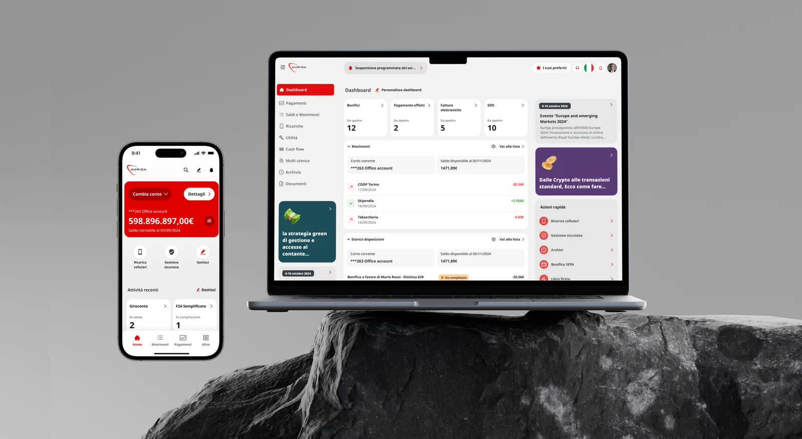
Redesigning the digital banking experience Auriga delivers to its partner banks, a new architecture, a reusable operation template system and a white-label design system for web and mobile.
CORE PROBLEM
Too many operations, no clear structure
SimplyMobile is the mobile and internet banking solution Auriga provides to its partner banks to manage accounts, payments and documents. Over time, new operations were added, each with its own structure and entry point, making the product harder to navigate and maintain. In particular, the redesign needed:
- A new information architecture able to hold dozens of banking operations without getting lost in menus.
- Standard operation templates, so every payment flow behaves the same way.
- A white-label design system, so every partner bank could apply its own brand without new design work.
- Two touchpoints, one logic: a web platform for heavier, business-oriented use and a mobile app for quick, everyday tasks.
DISCOVERY
The goal was not to invent new features, but to understand and reorganise what already existed. I started by mapping the current product end to end.
Stakeholder workshops
I ran workshops with Auriga’s product team and developers to align on business goals, technical constraints and the priorities of partner banks.
As-is audit and architecture mapping
I mapped the whole as-is architecture and every banking operation template. This made the main issue visible: very similar operations used different structures, field orders and confirmation steps.
UX DECISIONS
One hub for all operations
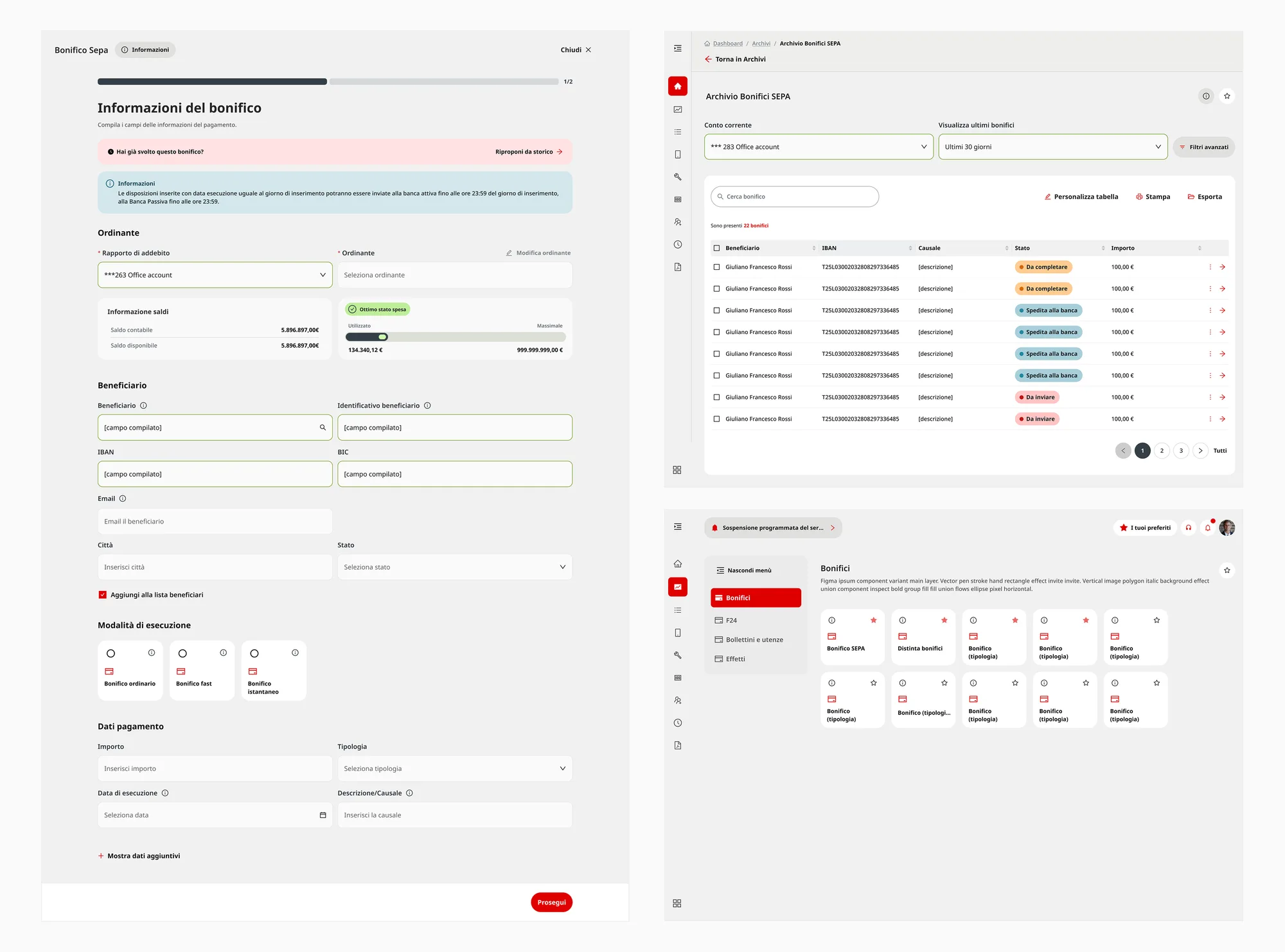
All operations are grouped into three categories: Payments, Information and Archives, with search, A–Z filtering and favourites.
Customisable home
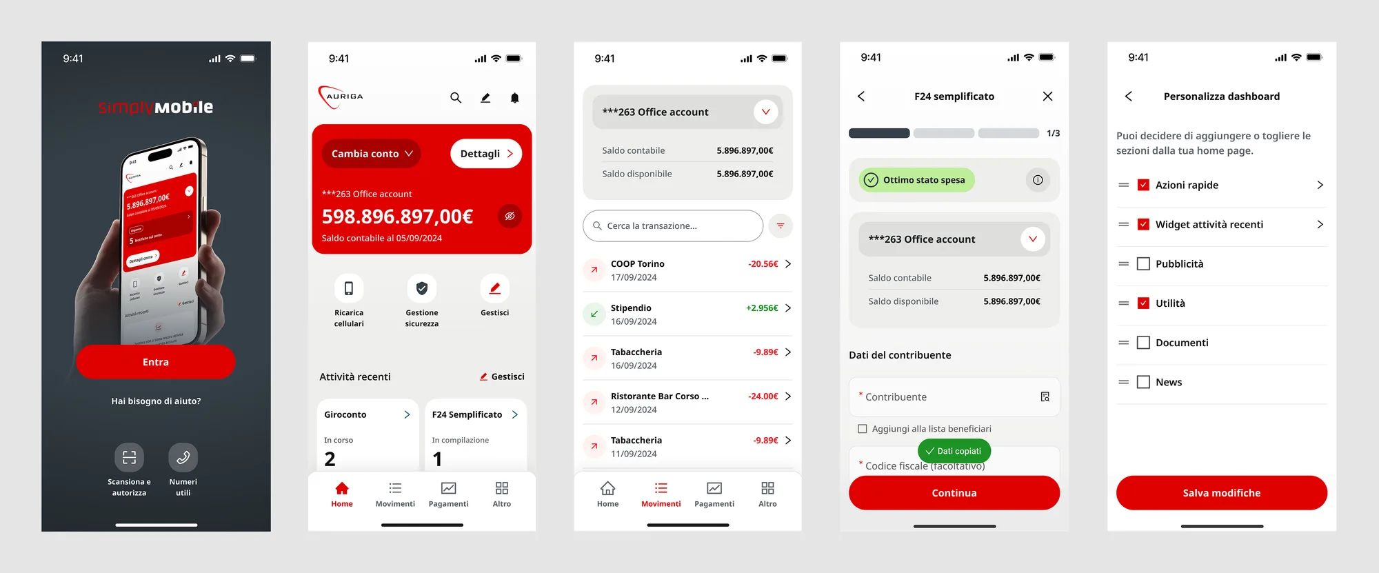
Web and mobile dashboards let users personalise widgets, quick actions and sections while keeping a consistent structure.
Standardised payment flows
All payments follow the same simple journey, with reusable templates, saved beneficiaries and optional fields kept hidden.
Web & mobile, different needs
Web supports complex business tasks, while mobile focuses on everyday actions and native features like biometrics and QR scanning.
IMPLEMENTATION
Concept design
I rebuilt the architecture around the Hub and defined the operation templates. Each flow was mapped with its edge cases, such as errors, empty states and denied permissions.
Visual design & design system
I built a token-based white-label design system. Each bank applies its own brand while components stay the same across web and mobile. Accessibility guided every choice, status is never shown by colour alone, contrast is high and touch targets are generous.

RETROSPECTIVE
- Mapping the as-is was key: templates only became possible once every operation was visible side by side.
- Designing white-label from day one produced cleaner, more reusable components.